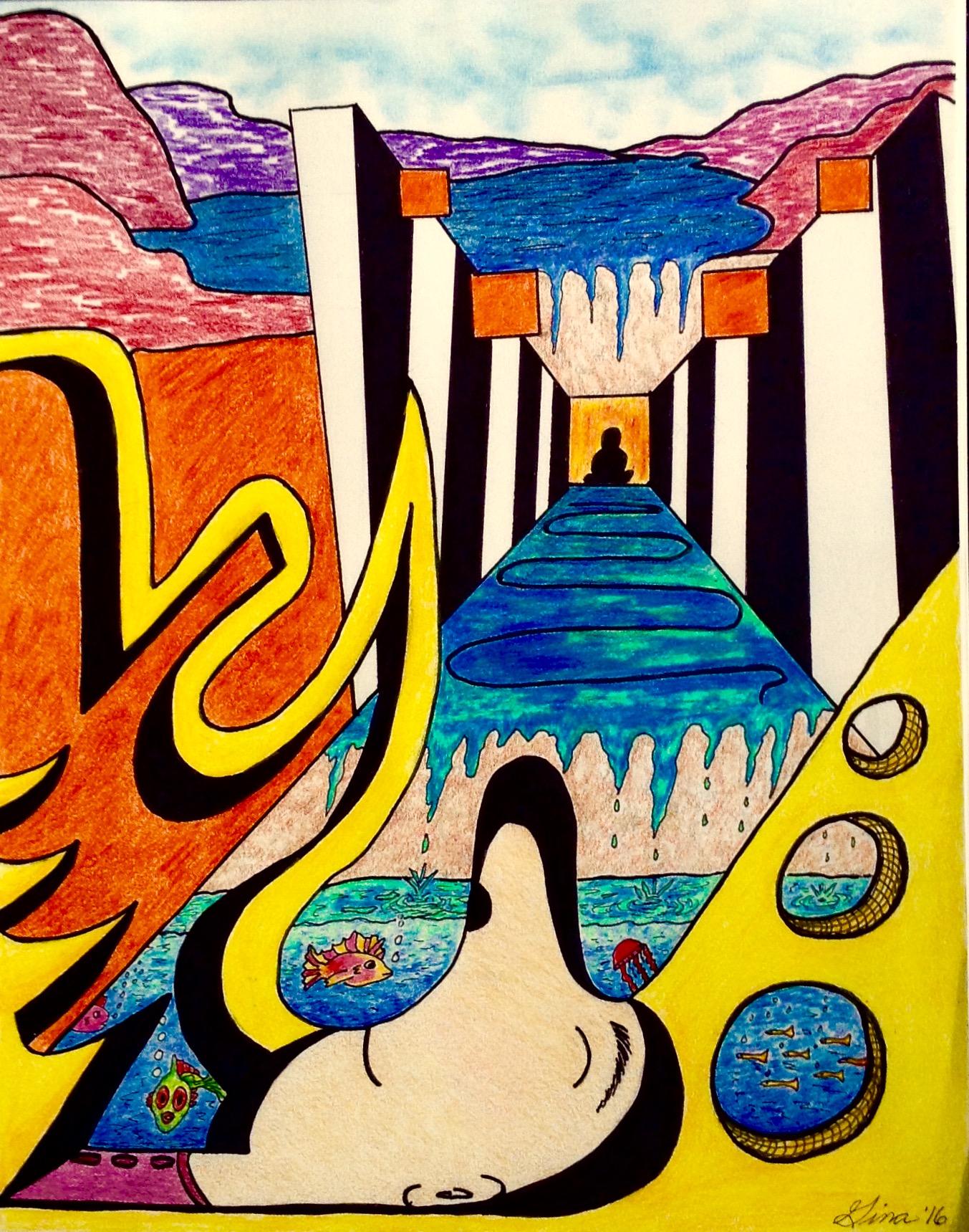
In class we discussed in detail the Elements of Art.
Line– can evoke emotion depending on how you use it. For example, horizontal lines are quiet and peaceful, vertical lines signify strength and power, diagonal lines imply movement and speed, and free form lines express feeling free, individuality and creativity.
Space– the illusion of depth in space by overlapping and perspective.
Shape– a 2D area
Form– a 3D area
Color– warm colors, cool colors and using contrasting colors for emphasis.
Texture– all the ways to achieve it
Value– creating form, contrast and shadows/shading from light to dark.
Using all the elements your assignment was to create a composition using the Principles of Art.
Unity/Harmony, Variety, Balance, Graduation, Emphasis, Rhythm, Movement, Pattern, and Proportion.
We began the composition by using the “check back method” to draw our first line.

After drawing this line you were free to create your composition. Everyone came up with amazing and different works of art!
These are the steps I took, using this line as my starting point. It can serve as a guide for a way to approach this assignment.

I began by blocking out a focal point for my composition creating depth using one point perspective and a free flowing line for movement. I decided to put squares at the top going in the reverse direction and keeping a 2D form to create friction.

I blocked out the background, on the left top side, to position where the background was to begin.

I put mountains in the background by overlapping to achieve depth. At this point I established my foreground, middle ground, and background.

I now began developing the middle ground creating movement, variety and graduation. I also wanted a sense of harmony coming from and around the focal point even though I had not yet decided what the focal point would be, just where it would be.

I focused on the foreground giving it form, (assigning shadows) action (diagonal lines forming points to guide the viewer within the piece), repetition, pattern, and texture. I gave the viewer a peek into the middle ground using the holes (on the bottom right corner) and crosshatching to create depth.

I was now ready to ink. * Very important to use your kneaded eraser prior to inking to pick up the extra graphite from your pencil. You should be inking on an imprint of your drawing. If you skip this step your ink will not be clean and sharp and your colors will look dirty. Make sure you use a ruler when you ink to get nice straight lines. I also made a decision on my focal point.

Make sure your ink is dry before you begin your next step. *Prior to laying down the shadows, go over your picture once more to clean your drawing of all pencil marks
Darken in all the shadows carefully with ink.

Begin coloring. I chose Contrasting Colors- blue and orange and black and white to bring the viewers eye directly to the focal point. I used different values of blue to give the water depth as well as green for the illusion of transparency.

I chose yellow in my foreground because of its subtle blending with the water, keeping a sense of serenity and its a warm color, making it a perfect choice for the foreground. Notice when I color I use at least 2 values, if not more, to color everything. Colors tend to look flat lacking richness or depth when used alone.

I picked cool colors on the mountains in the background for its receding qualities and to create a calming effect. I used a texture techniques (squiggles) to color them in. Again using more than one color on each of the mountains.

I modified my piece by drawing a line on the left, enclosing it and coloring it orange to pull the orange squares on top towards the viewer creating more action and unifying the piece together. I also expanded the water and added more fish.

I completed the art by drawing a face peaceful and resting, using a cool color from the mountain above on his shirt. I also added different browns under each waterfall utilizing different textures overlapping each other. For the blue sky texture created that fluffy appearance.
Before I signed my name I did a few touch ups to make the Art crisp and clean.
The finished piece uses all the Elements and Principles of Art.
